Improving Our Slow Zone Tracker
Our slow zone tracker has been a huge success—not only has it been a valuable tool for T riders to validate their experiences, but it has also been useful for MBTA accountability. It provided valuable insight into slow zones before and after the Orange Line shutdown, and more recently we have been tracking the worsening slow zones on the Red Line. We’ve also been referenced a few times:
The Boston Globe - It’s not just the Orange Line: Poor maintenance is slowing whole T system
Boston Herald - Orange Line is slower, more speed restrictions in place than before shutdown
We’re able to build these tools and make a difference because of support from the public. If you would like to make a donation, you can do so here.
After eight months of tracking slow zones, we’ve decided to make some changes to our calculation methodology. These changes are going live today, and we’re excited to share them with you. What follows is an in-depth description of what we changed.
TL;DR
For the Total Slow Time page: We now determine each slow zone’s delay on a per day basis. We previously used the average delay over the entire duration. The graph is noisier, but it more accurately reflects changes over time.
We updated our algorithm for determining slow zones by adding the criterion that a segment must have at least 4 days of delayed trips.
For the Line Segments page: The delay time displayed for a given slow zone is now the median delay rather than the mean.
Change 1: Daily totals determination for the line graph
We changed how we calculate daily slow zone totals (graph).
Previously:
For each day that a slow zone exists, add the slow zone’s mean delay. This is defined as mean(daily median trip time - baseline) over the duration of the slow zone.
Now:
For each day that a slow zone exists, add the slowzone’s delay from that particular day only. This is defined as simply (daily median trip time - baseline). If there is no data for a particular day due to shuttling e.g., we use the last available data so that they don’t falsely appear to be fixed.
Why is this better?
It shows the state of the system on a given date more accurately. Previously, if a long-running slow zone was improving or deteriorating, it would be difficult to notice since the value shown over the course of the slow zone was constant. Furthermore, each new day’s data could affect the line graph for previous days because it could change a slow zone’s mean. Now, we show each day independently to better reflect changes as they are made.
For example, consider a slow zone with these delays:
| Date | 1/17/23 | 1/18/23 | 1/19/23 | 1/20/23 | 1/21/23 | 1/22/23 |
| Delay | 3 minutes | 3 minutes | 1 minute | 1 minute | 1 minute | 1 minute |
Previously, we would show a flat mean across all 6 days, and that mean would change gradually from 3 minutes to 1.6 minutes with each new day that passes. Now, each day will be represented on the graph by how much delay there was that day. This means we will be able to see the improvement immediately on 1/19/23.
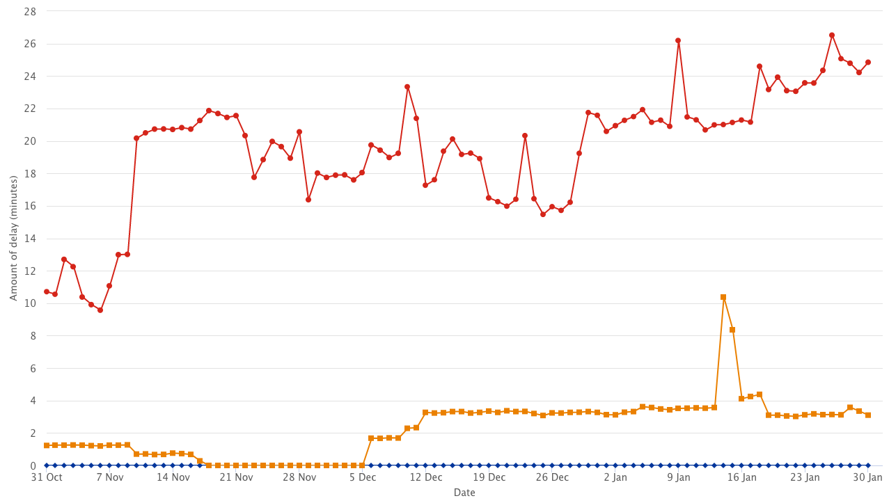
This is how our total slow zones graph looked before the change:
Slow zones graph before the change.
This is what it looks like now:
Slow zones graph before the change.
The new graph is noisier, but it more accurately represents the system’s real delay on each date.
Change 2: Slow Zone Determination
We changed what we define as a slow zone. The definition of a slow zone depends on what we call a delayed day.
A delayed day defines whether the travel time between two adjacent stations is delayed on a given day
A delayed day between two stations is determined when its trip time is 10% greater than the baseline triptime - this has not changed. What has changed is what we call a slow zone.
Previously any span of time during which there were 2 or more days of delayed trips within 4 days of each other was a slow zone. There is now an additional criterion: This span must contain at least 4 days of delayed trips.
Change 3: Line Segments Delay time
This change affects the line segments page (this graph).
The delay displayed on each segment is now the median delay over the period rather than the mean delay.