Labs

Crawling Along: Introducing the Slow Zone Tracker

Crawling Along: Introducing the Slow Zone Tracker

Tracking Slow Zones on the MBTA

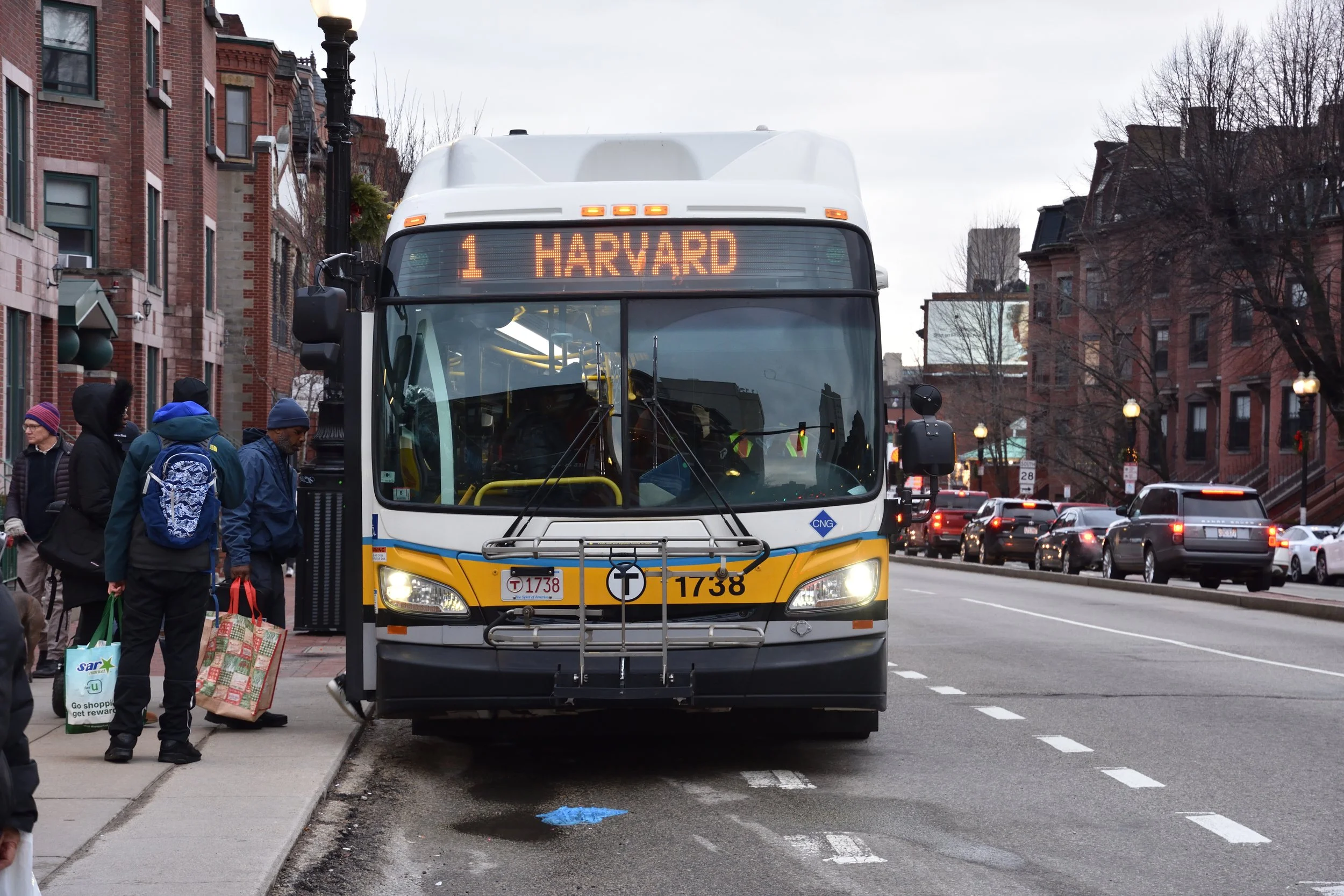
Do you ever find yourself sitting on a subway car that is just crawling along? Maybe you’re running slightly late already. And maybe you start to wonder… “Surely it hasn’t always been this slow. Is it just my train? Has it been like this the whole week? Is it getting worse?”

The TransitMatters Labs team is happy to announce a new tool that answers these questions. Our new Slow Zone Tracker makes it easy to tell when trains are running consistently slower than usual.

Slow zones on a rail line usually pop up due to infrastructure problems such as poor track condition, signal failure, or power issues. For example, StreetsblogMASS recently reported that the Orange Line has been given a lower speed limit in some sections due to deteriorating track conditions. And in 2019, for instance, the Red Line was severely delayed after the June 11 derailment took the signal system offline.

Our line graph gives a high-level overview of these sorts of systemic slow downs—how much time is being lost compared to how fast the trains theoretically could run? Is it getting better or worse over time?

Switching to the segment view allows you to dig in deeper: which pairs of stops are seeing delays, and how bad are they?

Clicking on one of the bars will take you to the data-dashboard page where you can see the data itself. In most cases, it will look something like this:

Or like this:

In some cases, severity may vary over time. Our algorithm looks at dwell times in addition to travel times, since waiting longer than usual at a station also counts as a delay. 

Our algorithm isn’t perfect, of course. If you notice any issues or want to send any other feedback, let us know at labs@transitmatters.org.


FAQ:

What is this?

This is a tool to help find and track slow zones. That is, areas where trains have lower-than-usual speeds due to track conditions, signal issues, or other infrastructure problems.

How do we calculate this?

We look at the daily median travel time + dwell time for each segment along a route. Whenever that trip time is at least 10% slower than the baseline for 3 or more days in a row, it gets flagged as a slow zone. Currently, our baseline is the median value in our data, which goes back to 2016. It’s not a perfect system, but various algorithmic improvements are in the works.

Why did we build this?

There’s power in data, but it’s only useful when you can tell a story. Slow zones are a nice story to tell: they tie our observable results to a cause. With so much data available, it can be difficult to find the interesting bits. So we’ve built this tool to help us locate and track this type of issue (slow zones), and monitor the severity over time.

How can you use this?

Share it. Bring the data to public meetings. Pressure the T to do better, but also give them credit where it’s due.

What about the Green Line?

Due to variable traffic, much of the Green Line doesn’t have consistent enough trip times to measure. As for the main trunk and the D line? Coming “soon”.

Data Dashboard 3.0: Eyes on the Bus

In continued support of the TransitMatters mission to unite advocates and inform the public about the state of the MBTA system, TransitMatters Labs is pleased to announce that bus data is now available and ready for exploration in Data Dashboard 3.0.

The Data Dashboard carries a storied history. Our work on its first version began in 2019 with the objective of providing an easy-to-use web site to explore travel times, time between trains (headways), and time spent at stations (dwell times) for trips on the subway network. The dashboard’s update in 2021 began computing statistics on those metrics over time, allowing for analysis of longer-term system trends. We’re thrilled that updating the Data Dashboard to version 3.0 with support for MBTA buses means that both transit advocates and the public can scrutinize the bus network nearly as much as the subway. It is also incredibly significant for TransitMatters itself—it enables our campaigns and our partners to study the performance of bus routes to make better informed policy recommendations.

To view the new bus data in the Data Dashboard, head over to https://dashboard.transitmatters.org. There is a new slider to switch from Subway over to Bus in the top-left corner:

A slider toggle for bus and subway has been added in the top left corner

Switching the slider to “Bus” changes the Dashboard to a yellow theme—that’s how you know you’re ready to dive in. Select a route, an origin station, a destination station, and a date (or date range) to continue. Bus data is available from August 1, 2018 through November 30, 2021 on the following routes:

  • 1 - Harvard Sq to Nubian

  • 15 - Fields Corner / Kane Sq to Ruggles

  • 22 - Ashmont to Ruggles via Talbot Ave

  • 23 - Ashmont to Ruggles via Washington St

  • 28 - Mattapan to Ruggles

  • 32 - Wolcott/Cleary Sq to Forest Hills

  • 39 - Forest Hills to Back Bay

  • 57/57A - Watertown Yard / Oak Sq to Kenmore

  • 66 - Harvard Sq to Nubian

  • 71 - Watertown Sq - Harvard

  • 73 - Waverley Sq - Harvard

  • 77 - Arlington Heights - Harvard

  • 111 - Woodlawn - Haymarket

  • 114/116/117 - Wonderland - Maverick

The bus route selection bar looks similar to the subway bar

Unfortunately, buses don’t collect the information we need to compute dwell times (time spent at stop), so these are the three metrics available for bus:

  • Travel times

  • Time between buses (headways)

  • Travel times by hour - choice of weekdays or weekend/holidays

After selecting input parameters, the Data Dashboard then presents you charts for those metrics. Here is an example from Route 1:

You may notice the interquartile range is often larger than you would see for the subway. This is because buses are generally more variable, since they are more susceptible to factors like traffic, which changes throughout the day. To help dive into this phenomenon more closely, we added a new type of chart: 

This “Travel times by hour” visualization helps clarify the variability shown in travel times above: mid-day trips (especially during rush hour!) are much slower than early morning and late-night. We also added an option to view weekend averages here as well.

This data makes some bus network challenges incredibly clear, such as headway management and bunching. For example, here is evidence of bunching on Route 1 at Putnam Avenue, near its western terminus at Harvard Square. On this day, September 23, 2021, bus frequency fluctuated between 1 minute and almost 30 minutes, particularly in the middle of the day. This may be due to data collection issues (if a bus running on Route 1 had a faulty GPS locator, for example). However, in this case, the average is a bus every 12-15 minutes, giving credence to the bunching scenario over the “missing trips” hypothesis.

These charts also show how bus lane installation can greatly affect the rider experience. After the City of Boston’s installation of the center-running bus lane on Columbus Avenue, Route 22 travel times during the evening commute dropped from 14 minutes to 10 minutes.

Before bus lane installation (October 2021):

After bus lane installation (November 2021):

We’re incredibly thankful for MassDOT’s Office of Performance Management and Innovation (OPMI); they consistently publish bus departure data that we use for this feature in the Data Dashboard. This update would not be possible without the hard work of everyone there and at the MBTA.

TransitMatters is looking forward to seeing what the community finds in Data Dashboard 3.0. Check it out! We also continue to appreciate your questions and feedback, and heads up—we’re always looking for volunteers with skills in web programming, data wrangling, graphic design, and fun :-) The TransitMatters Labs team is reachable at labs@transitmatters.org. You can also follow or tweet at some of the team members who worked on this project on Twitter:

Austin Paul (@ajp5678)
Chris Schmidt (@crschmidt)
Preston Mueller (@mathcolo)
Nathan Weinberg (@Nathan_Weinberg)
Chris Friend (@friendchristoph)

Now Trending: Data Dashboard 2.0

Now Trending: Data Dashboard 2.0

When we introduced the TransitMatters Data Dashboard last August, we were thrilled to offer a new tool for exploring MBTA rail performance data. In our original release post, we outlined how the dashboard allows our community to view travel times, time between trains (headways), and time spent at stations (dwell times) for the Red, Blue, Orange, and Green Lines for any day back to January 15, 2016.

We're proud to announce that we've upgraded our Data Dashboard to support viewing aggregated data to visualize trends over as many as eight months. You’re now able to select a date range with the “Range…” button in the toolbar, making it possible to view daily medians & interquartile ranges for travel times, headways, and dwell times over extended periods—no longer just a single day at a time.

Selecting the Range option enables start and end date fields, allowing you to input a time range for which you would like to generate charts. The previously available single-day view is still there—just leave the end date blank.

The following charts show how travel time and headway metrics from Revere Beach to Aquarium have changed from January to April this year. Each black dot is the median value for that metric on that day, and the shaded region is the range between the 25th and 75th percentiles, also known as the interquartile range. A larger shaded region around a point indicates higher variability in that metric on that day.

Browsing these trends over time is useful for transit advocacy for a variety of reasons. One key area of discussion is rail slow zones. The MBTA sometimes introduces these reduced “speed limits” on sections of track due to maintenance or deterioration. Trends in performance metrics expose when these slow zones are introduced or fixed by the agency. For example, a slow zone between Back Bay and Tufts Medical Center stations on the Orange Line was fixed over a series of months in Fall 2020:

Another slow zone between Community College and North Station existed for just a single month, December 14, 2020 - January 13, 2021:

Trends can also expose effects of the COVID-19 pandemic. For example, on the Green Line C branch, travel times fell as much as 25% as road traffic decreased and dwell times decreased due to fewer riders.

The TransitMatters Labs team is looking forward to learning what trends you can find in subway performance data. Go explore yourself! Each chart has a unique link, enabling you to easily share your finds with others interested in this data.

We appreciate your questions or feedback; we’re reachable at labs@transitmatters.org. You can also give a shout out with your findings to some of the team members who worked on this project on Twitter:

Preston Mueller (@mathcolo)

Austin Paul (@ajp5678)

Chris Friend (@friendchristoph)